Het Klokhuis
Het Klokhuis
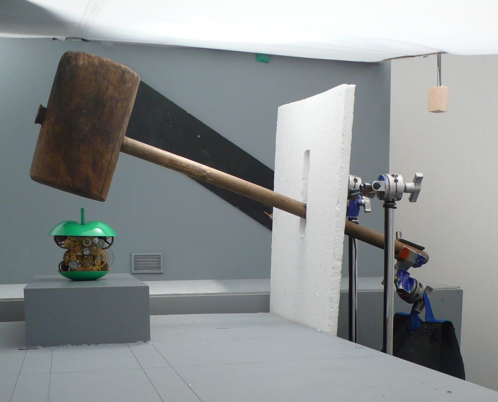
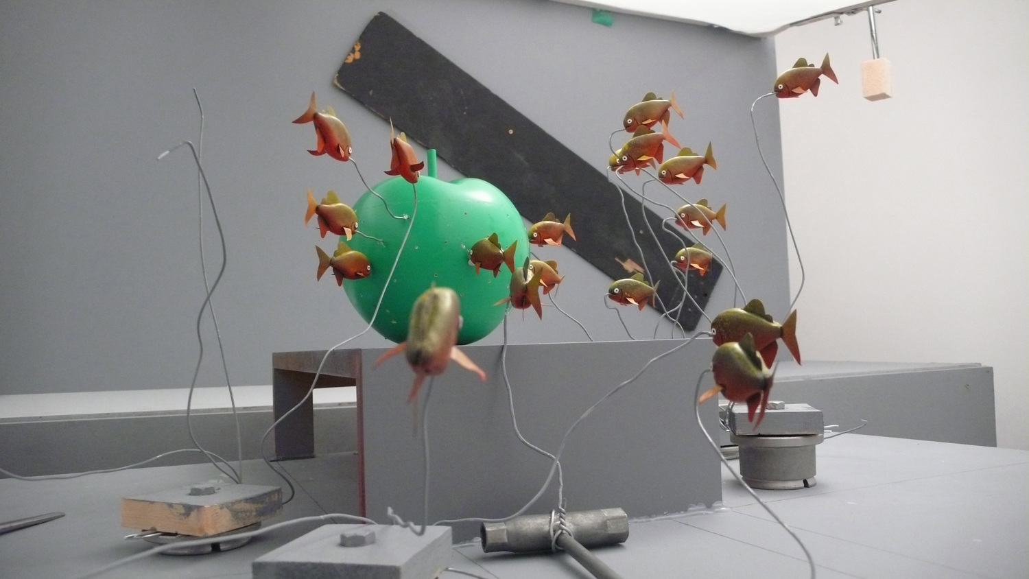
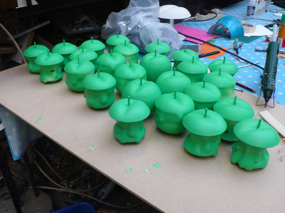
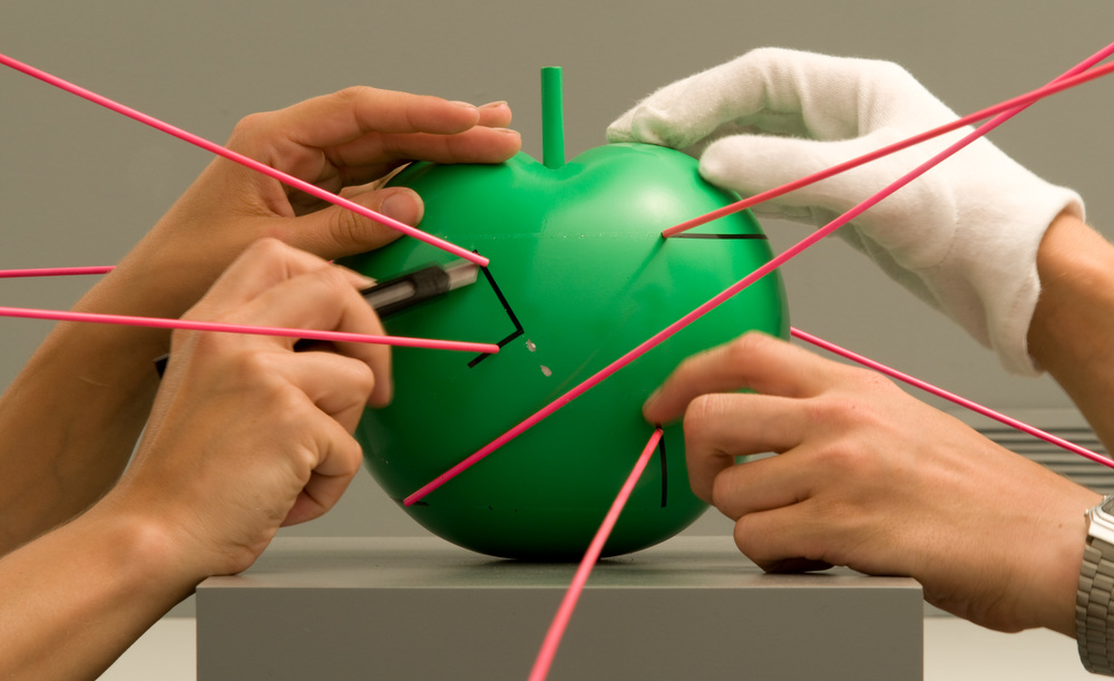
Dutch agency KesselsKramer approached Johnny with the brief as part of a rebrand for the programme, with the show’s new logo to be lifted from the animation for the title sequence. An apple is the basis for the new identity, as the programme’s title literally translates as ‘The Apple Core’. The stop-frame animation sees a series of apples, all with a different experiment happening at their core to wet the appetite for what’s to come.
Once Johnny had decided on which experiments to use he called on the talents of established model-maker, Jethro Haynes, and the pair retired to the laboratory to collaborate on the look and design of the piece and how each of the elements would be animated. ‘Het Klokhuis’ devoted it’s new look launch programme to the making of the title sequence.